Copyright 1995, Mustafa Uzumeri and David Nembhard
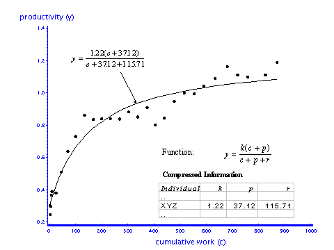
This study examined a large volume of electronically collected data on worker performance. This data was gathered for workers engaged in manual assembly operations in a large manufacturing firm. The raw data consists of records of work performance taken at frequent intervals during designated learning episodes. These episodes occur when workers are first hired or when they are reassigned to a new job. As workers tried to master the task, bar-code scanners recorded their output on a regular basis. From the analog perspective, each measurement of a worker's output is a "signal" of that person's mastery of the task. To describe this signal, we fit a 3-parameter model of individual learning. This function (shown in Figure 2) was chose because it was malleable, easy to apply, and is believed to reflect the way in which individuals improve both conceptual and motor skills.
Figure 2 - Fitting an Analog Curve to Individual XYZ's Productivity History
Since the function is non-linear, non-linear regression software was used to find the values of k, p and r that best fit the underlying data. Both the data and the fitted equation rise smoothly over the relevant range. Hence curve-fitting is straightforward and full convergence occurred in all but a small number (0.6%) of the episodes. Although equations with more than 3 parameters will mold more closely to subtle changes in the data, the goal was to create a picture of organizational learning that could be visually depicted in simple graphs. With only three parameters, it is possible to create diagrams that fully describe the signal shapes for an entire population of workers. Figure 3 shows an example of this for a subgroup of workers that are learning the same task. In this graph, each point summarizes an individual's entire improvement history and the learning behavior of the entire group is evident in the shape of the well-defined 'cloud' of points.
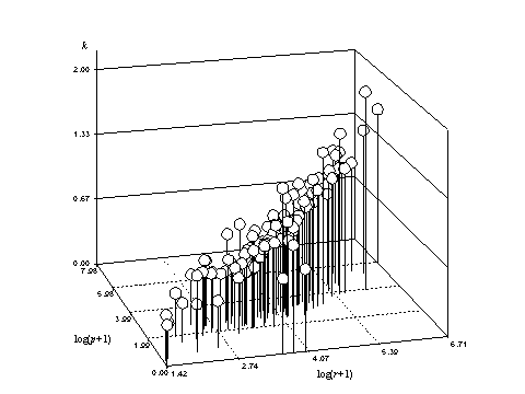
In the study of learning, more than 60,000 measurements were converted to the values of k, p and r that defined the shapes of 3,800 individual learning curves. Very little information was lost in the process and most of that was unexplainable variance or "noise". As a result, diagrams like Figure 3 have the potential to serve as very efficient "maps" to the distribution of learning behavior across entire groups of workers.
Other simple graphs can be created that compare learning behavior across different populations of workers and identify shifts in the distribution of learning behavior over time. Eventually, the data in graphs like these may also provide the basis for more effective simulations of learning in dynamic environments, where strategic business decisions frequently concern entire groups and populations (e.g., of employees, departments, products, machines, customers, and investments).
Finally, each point in Figure 3 represents a mathematical equation that can be manipulated both symbolically and numerically. One can, for example, find the derivative of the best fit equation and solve it to estimate the rate of learning for any level of accumulated experience. Alternatively, one can integrate the curve and use the result to calculate the average workforce productivity for any amount of experience. Calculations like these could help manufacturers to more accurately estimate manufacturing costs when product changes force employees to learn new jobs.
For a working paper on this topic (in zipped Word for Windows 6.0 format) click here.
This research is being conducted jointly with David Nembhard, a colleague at Auburn's College of Business.