ALANROGERCOOK
The Urban Typology. The architecture of the urban typology has a pedestrian scale and focus and is structured with figural spaces. Most urban buildings are infill types, meeting edge to edge and giving form to the street as a figural spatial entity. using Robert Venturi’s terms, they are decorated sheds; i.e., background, non-object buildings, spatially delimited by their functional task performance requirements, with ornament and signs superficially applied. In the urban typology the buildings are usually contiguous and serve as a ground for the figural space of the street. Only the most important public edifices are, as Venturi calls them, ducks; i.e., figural (object) buildings with their logically derived task arenas being morphologically distorted so as to become symbolic and/or novel for the purposes of enhancing their attention value, establishing figural hierarchy, and more easily communicating their identity at the scale of an observer in a moving car.
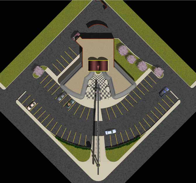
SITE PLAN
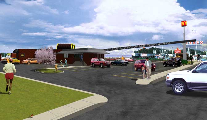
PROGRAM: The site was defined as a generic corner lot, 200' x 200'. The program called for 60 parking spaces, seating for 150 people, a drive-up facility and the other functional spaces of storage, food preparation, ordering, toilets, etc.
The parking scheme is a giant arc(h). The pedestrian access is honorifically symmetrical from the corner with an emphasized accessible path with a ramp to the false perspective cloistered court.
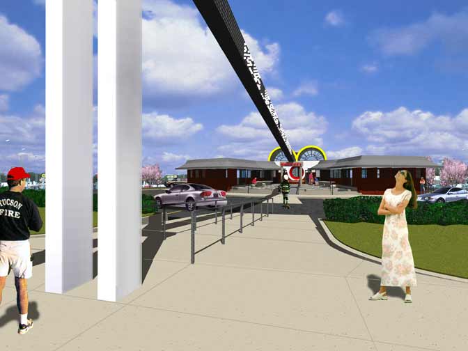
COMPRESSION & RELEASE: THE DANCE OF ARRIVAL
Throughout the design there is a rhythmic recurrence of the archetypal entry device of compression and release. By car there is necessary restriction at the site entry points which is common to virtually all suburban sites. But in addition here the cars are parked with a low enclosure so that when one approaches as a pedestrian there is the release experienced when the ramp/stair lifts us to the release of the open forecourt. This “cloister” forecourt then proceeds to further compresses the space towards the entry.
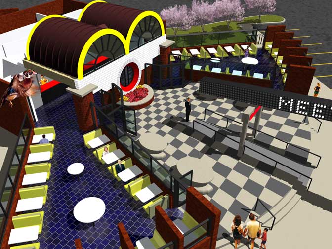
BUILDING PLAN
ROOF PLAN: this shows the double vaulted space over the arrial and ordering space which views onto the cloister court yard.
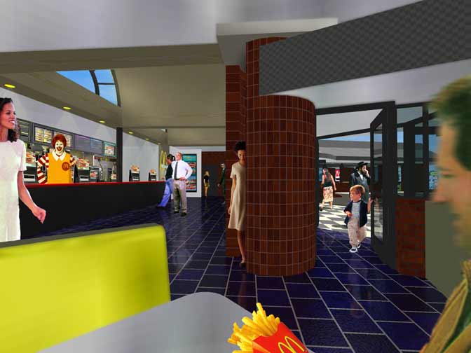
FLOOR PLAN: (place cursor on rollover plan ) this shows the seating layout, the drive-through window location at the upper left, the toilet rooms that flank the central ordering space, the round phone booths that help support the front wall and provide an expression of the circulation turning points around them. and the multiple access points for entry and exit.
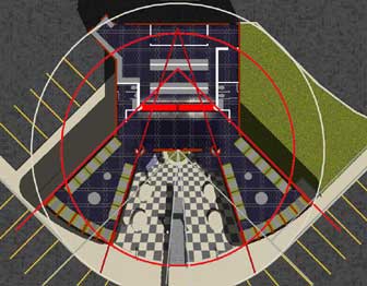
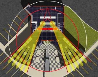
TRANSPARENCY & REGULATING LINES
The image on the left emphasizes in red the regulating lines forming the various arcs of the plan.
The yellow arrows emphasize the strategic dining room supervision points from the service area; this plan diagram changes (when the cursor is positioned over it) to include graphic arrows also emphasizing the transparency through the building from the central cloister court yard.
BUILDING SECTIONS (BELOW)
(The top one is a rollover image)

AUTOSTEREOGRAM OF SITE
By crossing your eyes you may be able to superimpose the corresponding points of these two images so that the image to the right is focused in your left eye and the image to the left is focused in your right eye. This should result in the perception of a 3-D image.

LOGO AS BUILDING FORM
This illustrates the parti of the original McDonalds store type which used the golden arches as pseudo structure made in the form of the corporate logo. The varying points of view change the regularity of the arches.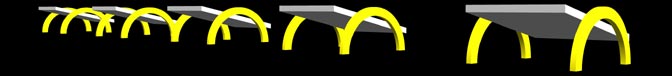
The (Golden) Arches. These corporate identity sign elements manifest variously as: vaults over the main interior arrival and ordering space; curves in the plan; the layout of the parking, the entry court seating and planter, the dining rooms, and as a cylindrical lighted sign atop the street corner pole with continuous arches around it sized so that only two are seen from any given approach view and thus appearing as the McDonald’s golden arches “M” logo. The vault windows, being oblique to the streets, will be foreshortened from the approach views along the streets thus appearing parabolic like the arches of the standard McDonald’s logo. This is partially biographical in that the first stores of the chain were sheds decorated with two semi-circular arches which when viewed obliquely from the roadway overlapped to form the now famous “M” of the parabolic golden arches..
FROM A FALSE APOLLO, TO DIONYSUS, TO A TRUE APOLLO
The use of the radius arches of the first McDonalds stores were applied signs with an implied but no real structural application. The parabolic arches of the corporate logo is a distortion of the radial arch in a manner that could be likened to the frenzied influence of the Greek god Dionysus. By using the radial arches as true structure and also as the climaxing arrival spatial form, the use of the arch has been given its most profound integrity as would be in the nature of the god Apollo.
In the theory of Robert Venturi, McDonald’s will have evolved their use of the golden arches logo from a decoration on a shed to an inherent part of the building’s spatial form. In this way the building’s status is changed to that of a duck; i.e., it has morphologically become a sign. In terms of the urban typological model it corresponds to an important civic edifice. The difference here with most other strip ducks is that the spatial form is not distorted at the expense of function and economy, but rather in the service and reinforcement of a powerful programmatic fit.

BOY MEETS GIRL: THE IMAGERY OF PREDICATE THINKING
As Sigmund Freud is quoted as having said, “Sometimes a cigar is just a cigar”, we can look at this design very innocently and overlook the embedded psychoanalytic themes of Eros and Thanatos. But is we dig, just a little bit, it becomes evident that besides death being symbolized by the sacrament of the food offering, the life urges are also boldly expressed. The act and organs of procreation are analogically presented by the signs and physiognomy of the building. Without being graphic I will let your imagination interpret the analogy from the design drawings. One descriptive clarification is needed to explain the dynamics of the horizontal marquee sign that extends from the vertically erect street corner sign to between the legs of the supine building and aims at its red orifice. It is an electrified beam which sends pulses of light energy (public notices) toward the goal space, the altar of life.
This view shows how the two supports of the corner sign form a positive-negative relationship with the pulsing light sign beam and starts the compression release sequence for pedestrians.
The pedestrian way in is highlighted by the beam and the narrowed traffic zone. the parking area is lowered while the building is raised in an effort to emphasize the pedestrian interaction with this place.
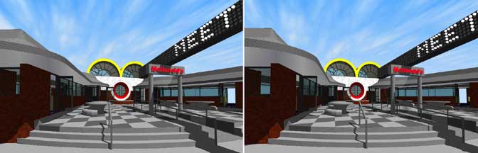
AUTOSTEREOGRAM OF THE CLOISTER / FORECOURT
By crossing your eyes you may be able to superimpose the corresponding points of these two images so that the image to the right is focused in your left eye and the image to the left is focused in your right eye. This should result in the perception of a 3-D image.
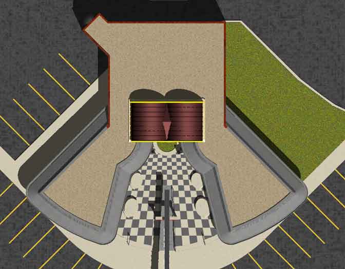
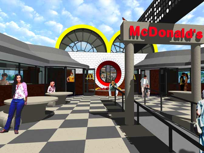
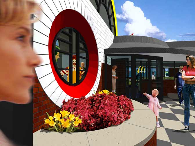
THE CATHEDRAL OF BURGERS
A subliminal metaphor embedded in the imagery of the entry facade is that of a gothic cathedral. The high vaults are like the west front bell towers, narthex, and nave. The oculus window is like a gothic rose window but instead of the Virgin Mary as the central focus icon, there is a muntin bar tracery resembling a hamburger; or alternatively, a number “1" which echoes the then current promotional theme that “You are number one”. It also establishes a goal place by framing the menu and the location where the meals/sacrament are received. In that eating is at the essence of life, because it requires the assimilation of other life forms, it is a sacred act and may be likened unto original sin. The (repressed) guilt of this sin may be atoned by performing a sacramental ritual which symbolically reconciles the sacrificed life. Thus the cathedral image may subconsciously serve as an instrument for expiation. And as the miter of the bishop resembles the elements of a gothic cathedral’s front, so the front of this store resembles the high priest of burgers, Ronald McDonald.
Ronald McDonald. (rollover) The exterior approach elevation of the ordering space is a giant simile of Ronald McDonald’s face, enlarged yet further by the scale illusion of the false perspective. The two vaults appear to be the brows/lashes/eyes of R. M.; the cental oculus, his nose; and the planter, his mouth. From the entry forecourt the perspective of the paired front and back arches of the vaults gives the illusion that this giant clown is always looking toward the observer thus reinforcing the repressed religious/guilt idea as well as the self-conscious promotional theme mentioned previously, “You are number one”.
BOY MEETS GIRL: THE IMAGERY OF POTENTIAL ENCOUNTERS
The approach towards the ordering space provides views into the flanking dining spaces as well as proximate passage by the exterior seating at the outdoor dining tables and the centrally located seating height planter edge. The transparency and reflection options allows all manner of discrete as well as overt people watching oportunities.
A CLIMAX OF ARCS PUCTUATES THE DANCE OF ARRIVAL
The“cloister” forecourt narrows and compresses the space towards the entry where the “rose window” diagrammatically illustrates the compression-release entry paradigm with its tapered conical form. This window form also gives the illusion of a much thicker wall reinforcing the Gothic cathedral metaphor. Here a gathering of arched forms comes together; the vaults, the central oculus, the air lock entry footprints and their related overhangs.
The muntins of the "rose window", as mentioned previously, relates to the then protional theme making the customer #1, but it also is iconographic of a burger, the holy grail and eucharist of the loyal McDonalds' diner.
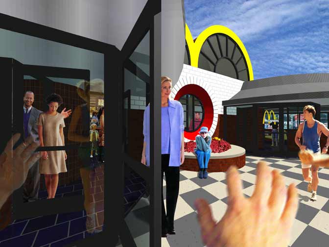
THE FINAL ANTICIPATION
The airlock entries have a lowered ceiling and the cylinder supports at the two main entries compress us again.
The abundance of glass planes juxtaposed at obtuse, and in the cases of the doors, changing angles, provide a variety of reflections enhancing the anticipation for the arrival space.
This is also the place where the olfactory senses get their first lunch punch.

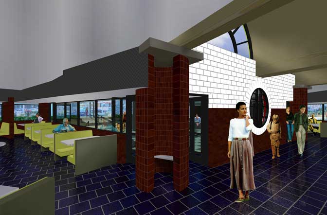
COLUMNS / TOWERS / BOOTHS
The hollow and open cylindrical columns at the corner of the two entry air locks are towers that are occupiable and serve as public telephone booths, thus they are associated with the term “bell” both as a reference to the telephone company* and to the idea of the metaphorical gothic cathedral with its twin bell towers of the west work facade.
* At the time of this design there had been no telephone industry de-regulation.
THE ARRIVAL / RELEASE CLIMAX
The menu ordering hall is the climax space in this sequence since it is the point of purchase and the place where the object of our desire, i.e., food, is accessed.
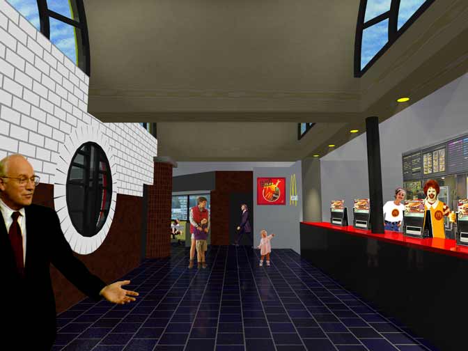
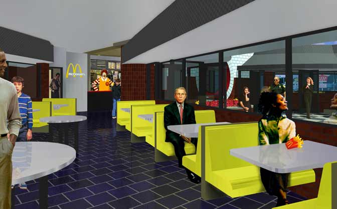
A VIEW TOWARDS SECURITY
This view is from behind the counter and shows how it strategically encopasses the dining room giving the employees visual control over the space as well as letting the customers know that they are in view.
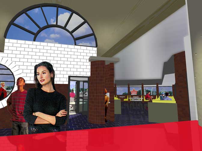
BONNE APPETITE
This is a view from the first booth showing the option of choosing a place emersed in an abundance of activity. At the opposite end of the dining room, away from most of the circulation, are booths organized in a radial fashion from the point of view of security with wall enclosures on two sides providing the choice for a different level of activity.
RADIAL BOOTH VIEW
The dining rooms have a high ceiling in their circulation zones but provide an intimacy-increasing lowered ceiling over the dining booths. The recurring compression-release rhythm of this restaurant is metaphor for the essence of eating as it relates to mastication. It also serves to metaphorically emphasize the Freudian subliminal message of Eros by making this theme dominant as it is a sublimation of the trauma of birth.
In this view we can see "W", the resident, contemplating the profound subliminal messages encoded in the design.
THE DUCKS HAVE IT
This roof-off view shows how the spaces flow together. Some of the compression-release events visible here are:
the electronic information beam and support gateway
the convergent forced perspective space of the forecourt
the squeeze between the planter and the arcs of the air lock entry footprints
the compressing passage around the phone booth column cylinders
and the bottleneck entry into the dining spaces from the vaulted ordering spces which decreases the sound pollution in the dining spaces